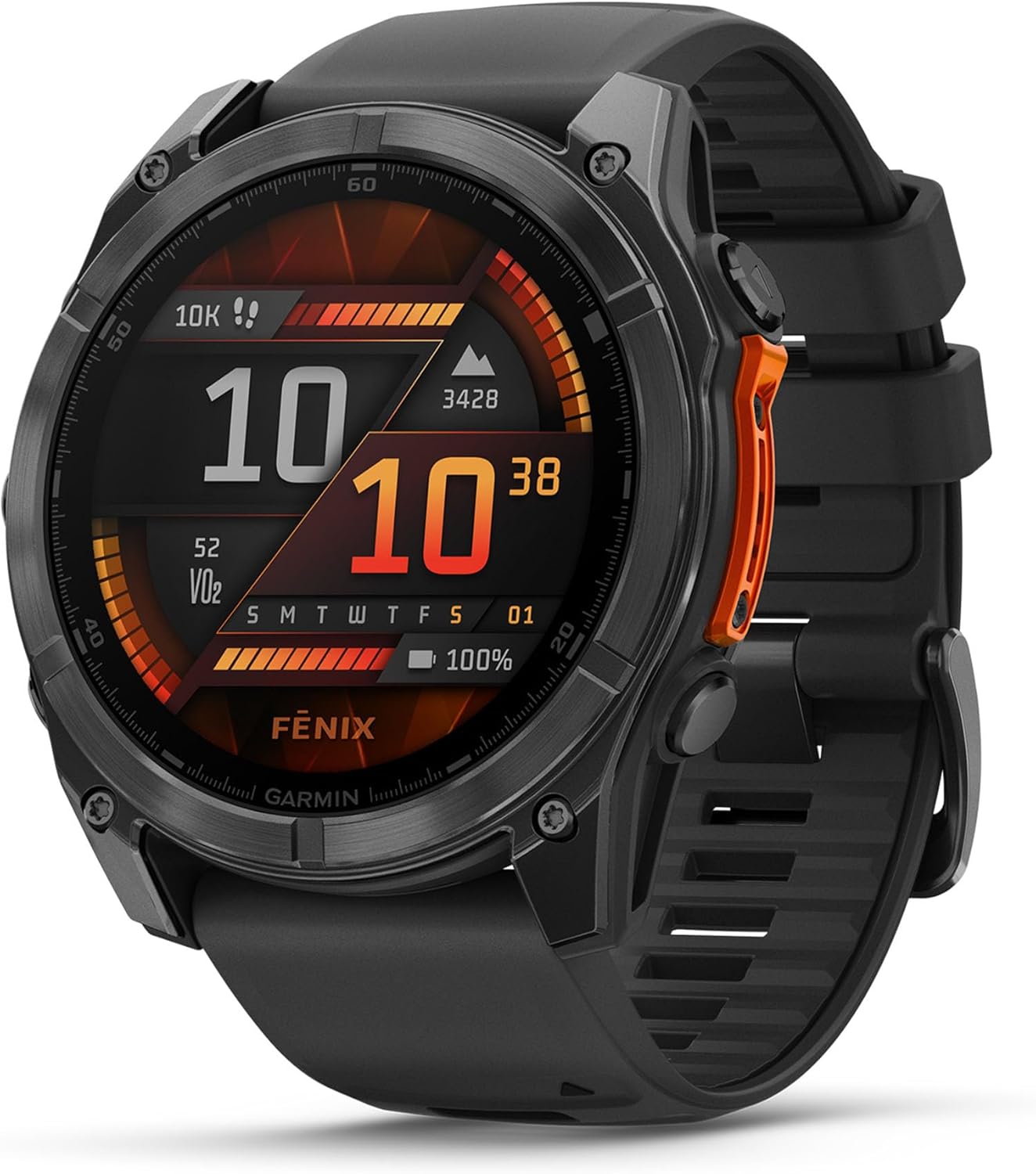
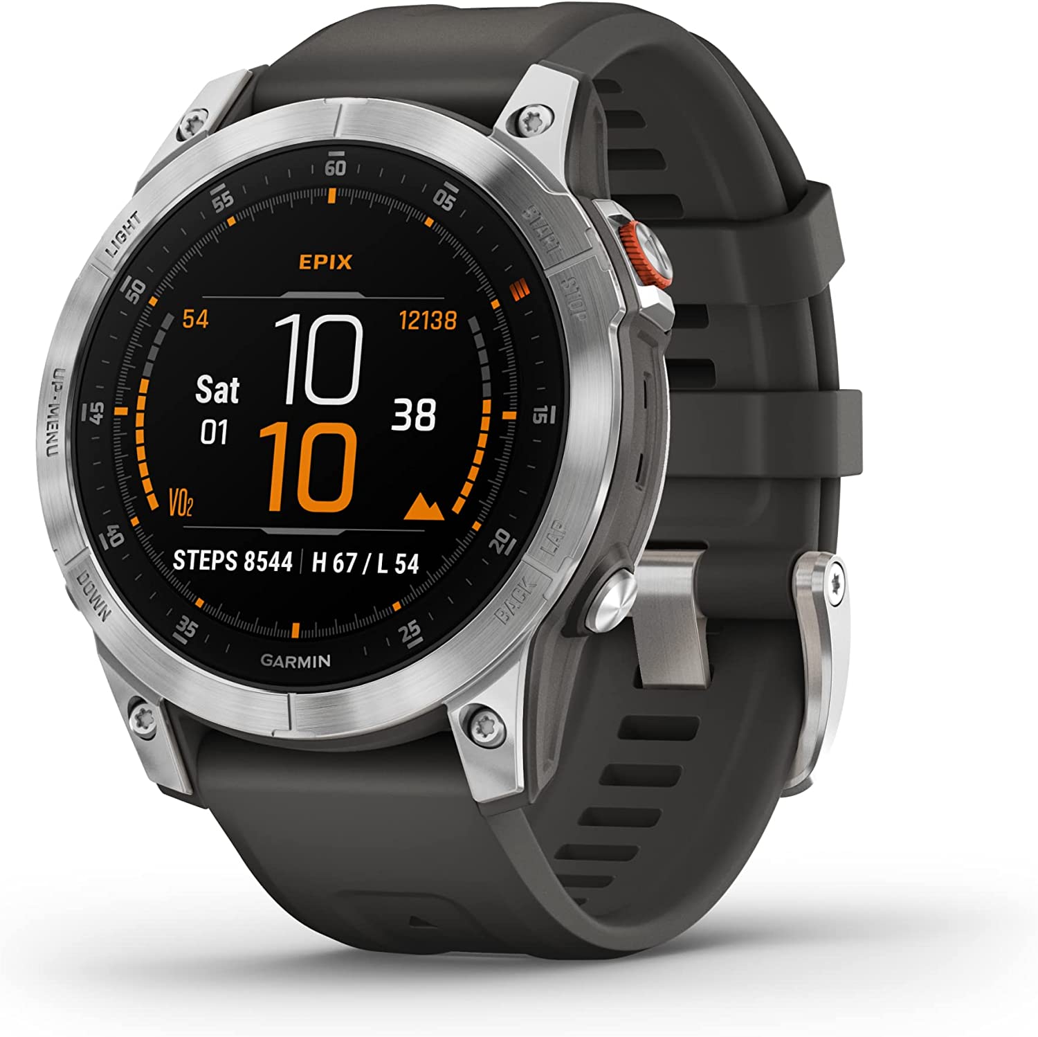
Let’s be honest—we’ve been waiting for Garmin to catch up with the rest of the smartwatch scene in terms of fluidity and polish. And now that the Garmin Fenix 8 51 mm has arrived to go toe-to-toe with the already iconic Epix Pro (Gen 2) 51 mm, it’s hard not to raise an eyebrow. Especially when they seem, at a glance, like variations of the same idea.
Same size, same resolution, same AMOLED charm—what gives?
But once you put both of them through their paces, the differences start popping up in the small places—the stuff you only notice when you live with one of these on your wrist every day. This isn’t just a spec-sheet standoff—it’s a test of who learned more from the last generation. And we’re going to tell you everything you need to know.
Let’s break it all down and figure out which of these two is more than just a pretty face.
A display upgrade that levels the playing field
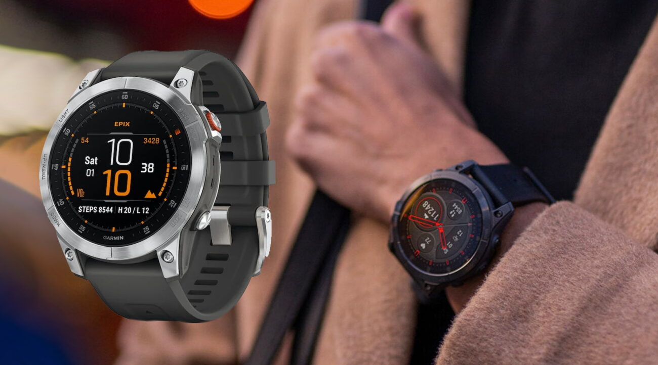
Gone are the days of MIP displays making your expensive Garmin feel like a digital relic. The Fenix 8 has embraced the AMOLED screen with the same 454 x 454 resolution as the Epix Pro Gen 2, bringing vibrant color and razor-sharp clarity to a watch that used to scream utilitarian.
We get it—if you’ve already spent time with the Epix Pro, this isn’t shocking. But in the Fenix 8, it feels more embedded into the soul of the watch, not just grafted on. Menu layouts have been rethought. Fonts are smoother. Contrast feels more intentional. It’s as if the display wasn’t just upgraded—it was considered from the start.
And that makes a difference when you’re checking stats mid-run or swiping through widgets while half-awake at 6 AM.
Speed and responsiveness that don’t get in your way
You know that feeling when a smartwatch thinks for a second too long before doing what you asked? Thankfully, neither of these suffer from that anymore—but the Fenix 8 just feels a tad more polished.
The new chipset and better software optimization in the Fenix 8 make everyday interactions quicker and less fussy. No spinning wheels, no odd hitches when loading maps or toggling features.
What’s new—and actually useful—is voice activation that doesn’t feel bolted on. Long-pressing the start button now lets you summon your phone’s assistant, and it works. Not in a “demo it once and forget about it” way, but in a “use it while cooking with flour-covered hands” kind of way. This voice interaction has clearly matured into a real tool, not just a spec-check box.
Smarter notifications and UI tweaks that matter more than they should
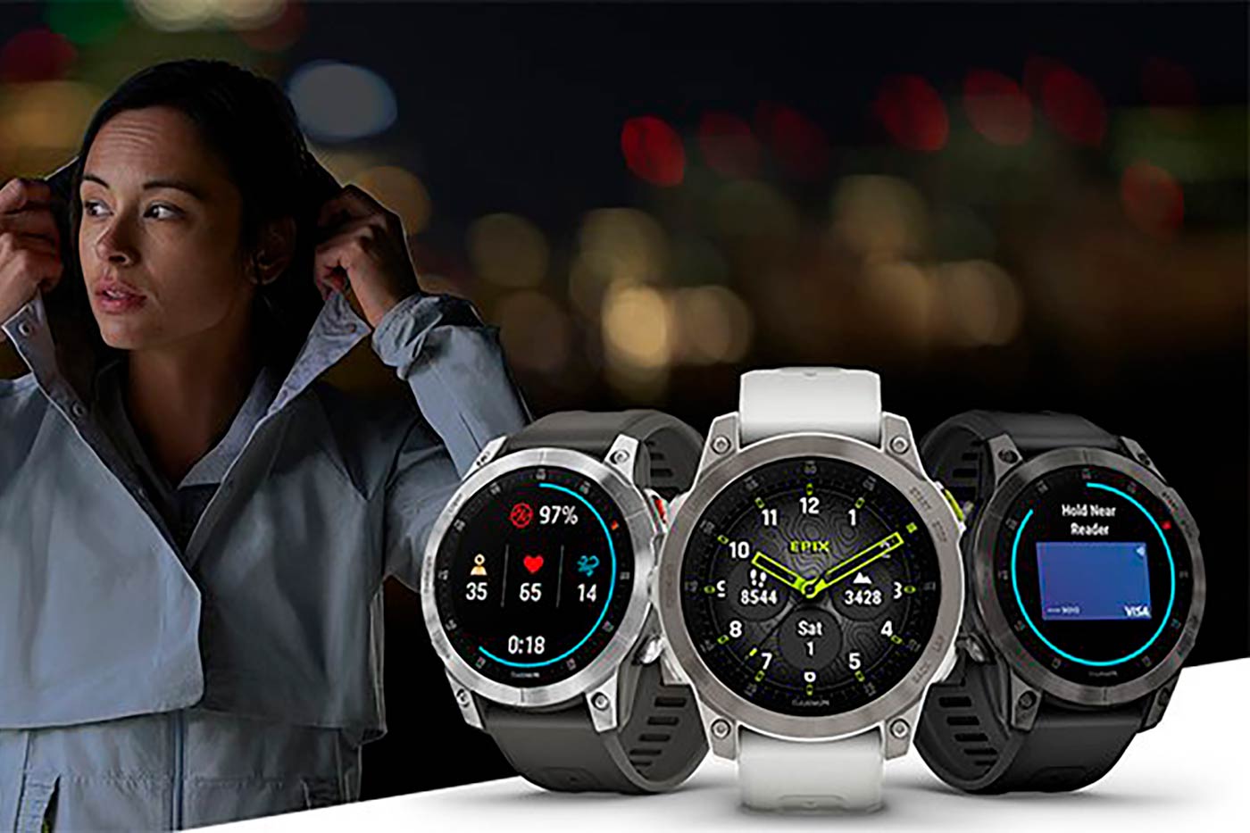
We didn’t think timestamps on notifications would matter. Until they did. On the Fenix 8, you see exactly when a message came in, which sounds like nothing until you’re deep into a trail run and trying to figure out whether that Slack ping was five minutes ago or fifty.
Small UI details add up. Navigating feels more predictable. Menus aren’t just responsive—they’re logically organized. And actions like ending sleep tracking don’t feel like you’re trying to outsmart the watch anymore.
There’s a maturity to how the Fenix 8 handles the same jobs the Epix Pro already did. It’s a quieter kind of progress, but not less important.
Design: same case, but different vibes
Both watches share the 51 mm case size, so they’re evenly matched on the wrist. But here’s the twist—the Fenix 8 feels like a cleaner version of the same silhouette. The case construction feels tighter, less fussy. It’s not about weight or thickness—it’s about presence.
Now, those “marshmallow” buttons? Yeah, they’ve divided opinion. Some call them too squishy. But they still offer positive feedback, and after a few days of use, you stop noticing. That’s a good sign.
Band-wise, there’s a hiccup: QuickFit bands work, sure—but if you’re into aesthetics, some colors clash badly with certain finishes on the Fenix 8. Minor gripe? Maybe. But if you’re the type who owns six different silicone straps, it’s a wrinkle you’ll care about.
The setup headache Garmin still hasn’t fixed
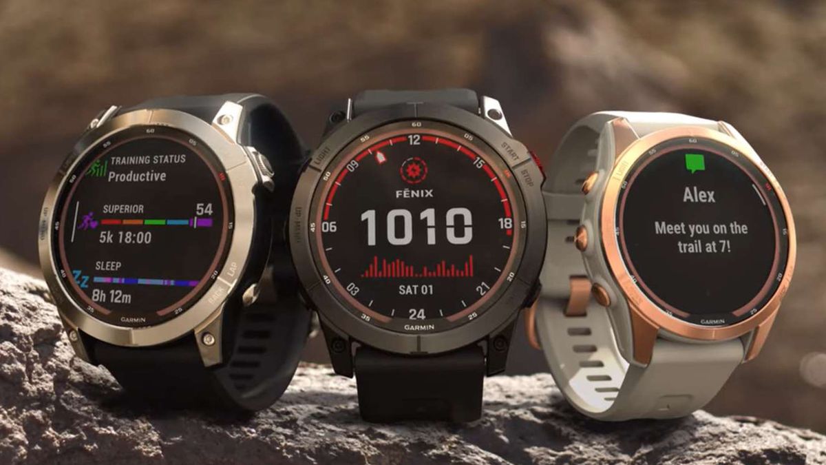
Switching Garmins should be as easy as logging in and syncing. Spoiler: it’s not. We were hoping for progress, but even with the Fenix 8, migrating from the Epix Pro means redoing all your activity profiles, custom screens, and watchface tweaks.
Sure, things like contact preferences and basic user settings carry over, but the lack of a true full-backup system still feels lazy from a company this experienced. It’s like buying a new MacBook and finding out none of your desktop folders copied over.
It’s not a dealbreaker, but it breaks the illusion that this is a seamless upgrade path.
That flashlight you didn’t ask for but now can’t live without
Let’s be honest—when Garmin added the flashlight, we rolled our eyes. Now? We use it almost every evening. Both the Fenix 8 and the Epix Pro have it, and it’s one of those utility features that sneaks into your daily habits.
It’s bright, fast to activate, and has a red-light mode for those who don’t want to wake their partner when fumbling for a phone charger at 2 AM.
As for the battery? This is where things are so close, you’d have to obsess over stats to care. Both models offer multiple days of life even with always-on display enabled and all health tracking on. But there’s a caveat: the Fenix 8’s efficiency feels a bit more tuned, stretching out those final 10% margins in a way the Epix Pro just doesn’t.
Not massive—but noticeable.
Voice assistants that finally act like part of the watch
This is one of the biggest shifts in how you interact with your Garmin. With the Fenix 8, voice functionality is no longer a gimmick. It’s stable, reliable, and actually gets used.
Calling up Google Assistant or Siri through a long button press, getting verbal feedback, setting timers—all of it works. More importantly, it works the same way every time.
Compared to the Epix Pro, where voice tools always felt slightly clunky or inconsistent, the Fenix 8 finally makes this feel like a natural extension of your wrist.
A software layer that just feels more thought-through
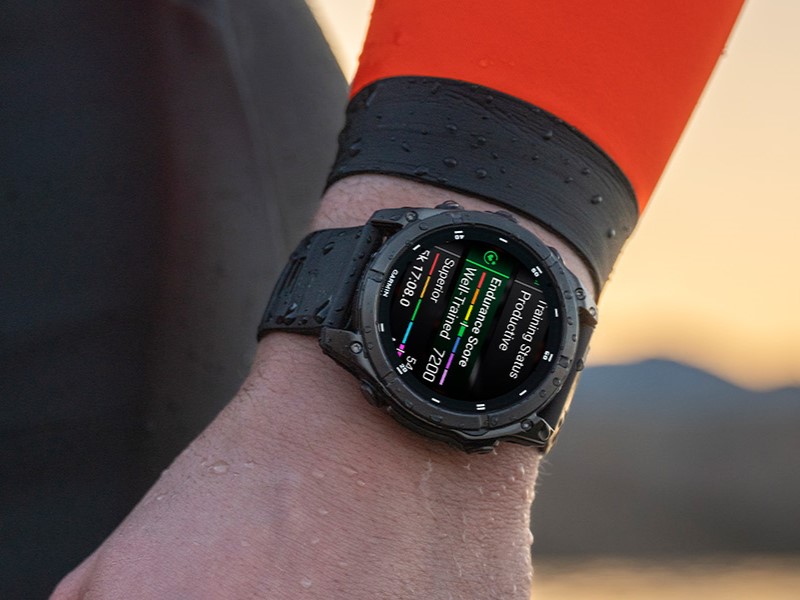
Even with the same screen resolution, the Fenix 8 manages to make things look cleaner. Why? It’s all about layout. Fonts have been redesigned, spacing feels easier on the eyes, and transitions between menus are smoother.
We’ve noticed that the animations are less abrupt, and elements like maps and heart rate graphs feel more integrated into the experience. It’s subtle, but it gives you the sense that the Fenix 8 is built for the next few years—not just a refresh for 2025.
Some annoyances do linger, like the odd way sleep tracking still requires manual input at times, but these quirks feel less glaring when the overall interaction is more fluid.
And now what? Our honest take
If you’ve read this far, we’ll just say it: the Fenix 8 51 mm isn’t just better on paper—it’s better where it counts.
Sure, the Epix Pro was the first to jump into AMOLED, and it did so with confidence. But the Fenix 8 takes that foundation and polishes it in nearly every area. The smoother interface, the tighter voice integration, the better notification handling—it adds up.
We didn’t expect the difference to feel this noticeable. Especially since the hardware is so similar. But the Fenix 8 feels like Garmin finally listened—not just to requests for new features, but to how people actually use them. It’s a smartwatch that feels less like a tool and more like a rhythm.
The only real letdown? Migrating settings is still a mess. That’s the one piece of friction in an otherwise upgraded experience.
So should you switch? If you’re still holding onto the Epix Pro, the Fenix 8 might not look like a massive jump—but it lives like one. You won’t be blown away at first glance. But give it a week. It’s in the details where this watch quietly pulls ahead—and once you notice, you can’t unsee it.

